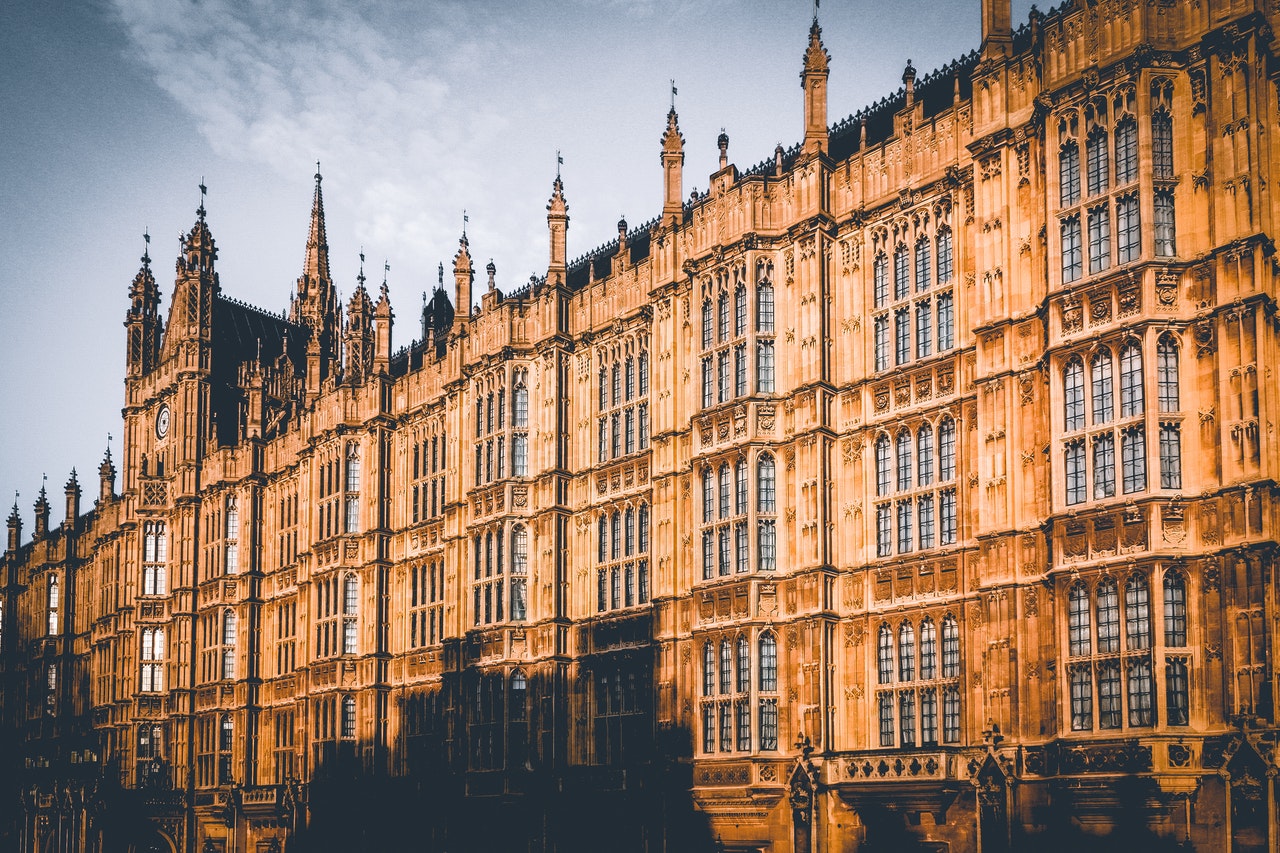
A few image manipulation classes.
Notes:
- You will need to narrow and widen your browser window to see the effect of these utility class examples below.
- For demonstration purposes, the placeholder image has been deliberately made square, with the subject (a European robin) positioned towards the center-middle.
Cover images
img-cover
This class sets the image to expand or contract to the full width and height of its wrapping block.
The proportions of the image are retained. If the actual image rectangle is different from the specified rectangle dimensions in your HTML, this will result in some parts of the image overflowing but hidden. Therefore the image will seem to be “cropped”.
The image below is a square, but you will only see a middle rectangle of it.

<img class="img-cover" src="" width="" height="" loading="lazy" alt="">Make your images big enough, but not too heavy
Follow these two rules when using img-cover:
-
If your image is approximately a square, with the focal point toward the center, you can use
img-coveras-is. Alternatively, if the focal point of the image is off to one side or corner, you may need to add a cover image position utility class. -
Be sure to optimize the filesize of your image. You don’t want to make your visitor wait a long time (several seconds, or more) for your image to load if they have a slow connection.
Many web platforms have image processors built in, or added via a plugin. For example:
- The Eleventy static site generator has an Eleventy-image plugin
- WordPress has a built-in image processor for automatic image resizing and loading for different sized devices (and lazy loading). Plus, there are several image-optimizer plugins.
- HubSpot has a built-in image processor for automatic image resizing and loading for different sized devices (and lazy loading).
Infographic: using img-cover

Some website content management systems handle “image crunching” for you. If you know your CMS does this, you can upload large images and it will generate several smaller images — and it will serve the appropriate sized image to the visitor depending on what sized device they are using (phones get serves a smaller, lighter image).
Some CMS’s also have “lazy loading” built in — they only serve larger images when the visitor has scrolled down to where they would see the image. That way, the image is not loaded up-front, and the page will seem to load quicker.
Cover image positions
img-cover defaults to positining the image from its centre-middle, so that all four edges (top, right, bottom, left) could be invisible outside of the constrained rectangle.
So, you would want the most important part of the image to be in the centre-middle, or else your visitors could lose part of it. Or, you may intend to shoft the visitor’s eye to different parts of the image, depending on what you are fixating on.
Since v.5.0.9 Codebase has img-cover-* positioning utility classes, using object-position.
img-cover img-cover-topimg-cover img-cover-top-rightimg-cover img-cover-rightimg-cover img-cover-bottom-rightimg-cover– image is centred and middled (default)img-cover img-cover-bottomimg-cover img-cover-bottom-leftimg-cover img-cover-leftimg-cover img-cover-top-left
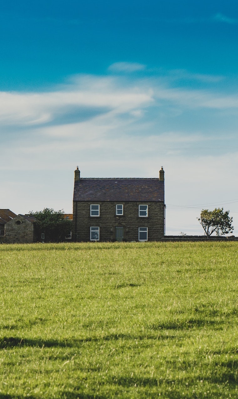
The same tall image, positioned vertically three ways (smaller images have aspect-ratio-2x1):
No image cover classes
img-cover img-cover-top

img-cover

img-cover img-cover-bottom

Photo by Andrew Hawkes from Pexels.
The same wide image, positioned horizontally three ways (smaller images have aspect-ratio-1x1:

img-cover img-cover-left

img-cover

img-cover img-cover-right

Not exemplified here: corner positioning.
Contained images
img-contain
This class sets the image to expand or contract to the full width or height of its wrapping block.
The proportions of the image are retained. If the actual image rectangle is different from the specified rectangle dimensions in your HTML, this will result in some parts of the specified rectangle not being occupied by the image (whatever is behind the image in your HTML will still be seen).
The image below is a square, therefore on wider viewports, there will be empty space to its right and left.

<img class="img-contain" src="" width="" height="" loading="lazy" alt="">Note: The CSS classes img-cover and img-contain are designed to work on the <img> tag. They may not work very well on an embedded <svg> (i.e. if you copy-pasted the SVG code into the HTML). But they work fine if an SVG image is inserted into a page the normal way for images: via the <img> tag.
Image CSS filters
Grayscale filter

<img class="img-grayscale" src="" width="" height="" loading="lazy" alt="">Blur filter

<img class="img-blur" src="" width="" height="" loading="lazy" alt="">What if you don’t want the blurry edges spreading outside of the image rectangle? Then you can wrap the image in a block that has the overflow-clip utility class.

<div class="overflow-clip">
  <img class="img-blur" src="" width="" height="" loading="lazy" alt="">
</div>
Opacity and Images
Codebase has a set of opacity utility classes that can be used on images.
Since Codebase v5.10, there are hover states set for each.
opacity-100%/hover:opacity-100%opacity-75%/hover:opacity-75%opacity-50%/hover:opacity-50%opacity-25%/hover:opacity-25%opacity-0%/hover:opacity-0%
These opacity utility classes can also be manipulated by AlpineJS animations.
opacity-25%

opacity-50%

opacity-75%

Hover states:
hover:opacity-25%

hover:opacity-50%

hover:opacity-75%

Add a colored background behind the image, and the opacity enables the image to show as tinted:
opacity-50% over a purple background

opacity-50% over an amber background

opacity-50% over a green background
