Codebase contains some partially transparent white or black backgrounds that have a blur filter applied. These can be used as glassmorphic overlays in your web designs.
bg-black-glass-1/bg-black-glass-2/bg-black-glass-3/bg-black-glass-4/bg-black-glass-5bg-white-glass-1/bg-white-glass-2/bg-white-glass-3/bg-white-glass-4/bg-white-glass-5
Note: Browsers that do not support background-blur filters will simply get a partially transparent tint instead.
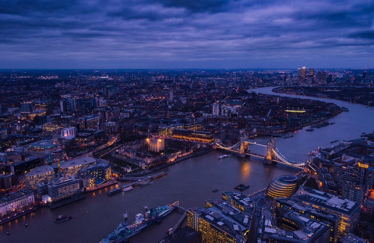
Glass over a dark background image
Dark glass bg-black-glass-* utilities over a dark background image:
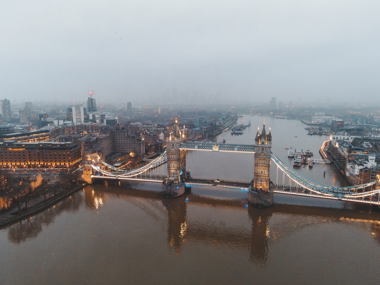
(None)-1-2-3-4-5Light glass bg-white-glass-* utilities over a dark background image:
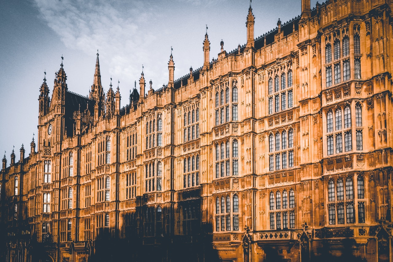
(None)-1-2-3-4-5Glass over a light background image
Dark glass glass-black-* utilities over a dark background image:
(None)-1-2-3-4-5Light glass glass-white-* utilities over a dark background image:
(None)-1-2-3-4-5Photo by Ollie Craig from Pexels.
Notes on glass
These glassmorphic overlays utility classes can be used in various ways. There are a couple of examples in the Codebase docs:
- The Codebase documentation uses
bg-black-glass-5for its topbar andbg-white-glass-5for its sidebar (but you will only see the sidebar glass when it is an offcanvas panel on narrow viewports). - Demos of modal components have a backdrop that uses
bg-black-glass-3. - Demos of hero components have an overlay that uses
bg-white-glass-3.
When you have your own background images, you can lay out panels and cards as an overlay (i.e. on a higher z-axis) and give them a glass background appropriate to your design.
Glass CSS variables
The glass utility classes are comprised of separate CSS variabled for rgba() alpha channel (tint) and background blur filter in the :root{}:
--alpha-1: 0.1;
--alpha-2: 0.23;
--alpha-3: 0.35;
--alpha-4: 0.58;
--alpha-5: 0.8;
--glass-1: saturate(1.8) blur(1px);
--glass-2: saturate(1.8) blur(4px);
--glass-3: saturate(1.8) blur(8px);
--glass-4: saturate(1.8) blur(13px);
--glass-5: saturate(1.8) blur(18px);
Of course, you can use different colors for greating a tinted glass effect. I don’t know what colors you will choose for your design – therefore Codebase contains only black and white glass background colors, allowing the colors from underlying images to show through.
- You can use one of the backdrop filters (glass blurs) with your own RGBA (or HSLA) color, adding your own alpha channel or one from Codebase (see above).
- Alternatively, you can use the backdrop filters without an alpha channel color (i.e. a transparent background).
Note: at the present time (November 2022) you still need to include a -webkit-backdrop-filter for Mac/iOS Safari.
Examples:
filter only (no tint)filter plus blue tintPhoto by Oleg Magni from Pexels.
/* Filter only */
backdrop-filter: var(--glass-2);
-webkit-backdrop-filter: var(--glass-2);

/* Filter plus blue tint */
background-color: rgba(0, 0, 153, 0.4);
backdrop-filter: var(--glass-2);
-webkit-backdrop-filter: var(--glass-2)